

Charitize: Building a three-sided-marketplace
COMPANY: Charitize ROLE: Design Lead, Product Design, Prototyping TOOLS: Sketch, Marvel, Zeplin
Company
Charitize is a marketplace web app where users can buy and sell services with all proceeds going to the charity of their choice.

TL;DR
Charitize was nothing more than an idea when the founding team came to us, so our team built out their first MVP from scratch. I led the team though an end to end design process, including developing three stakeholder flows, a component library, and a full brand guide.
Here’s a quick preview of some screens from the final product. More below about the process.
USER Research
I interviewed two types of people: those who primarily donate their time, and those who primarily donate their money. I wanted to understand how these people might engage with the platform, and what might incentivize them to become Buyers (the people buying a service, such as tutoring, handiwork, or child care) or Volunteers (the people doing the service, who choose to route their money earned into a charity instead of their own pockets).
These early interviews also gave us insight into the concept of Communities, which we knew the founders of Charitize wanted to be a central component of the platform. Time and time again we heard our interviewees say that they wanted to support organizations with which they have social connections (for example, if their friends have referred them there).

Competitor/Comparable Analysis
Following interviews, it made sense to research existing marketplaces. Charitize is a new concept, so the marketplace research expanded from volunteer sites to food delivery and freelance work to home shares and business fundraising.
Even across industries, some important patterns stuck out.
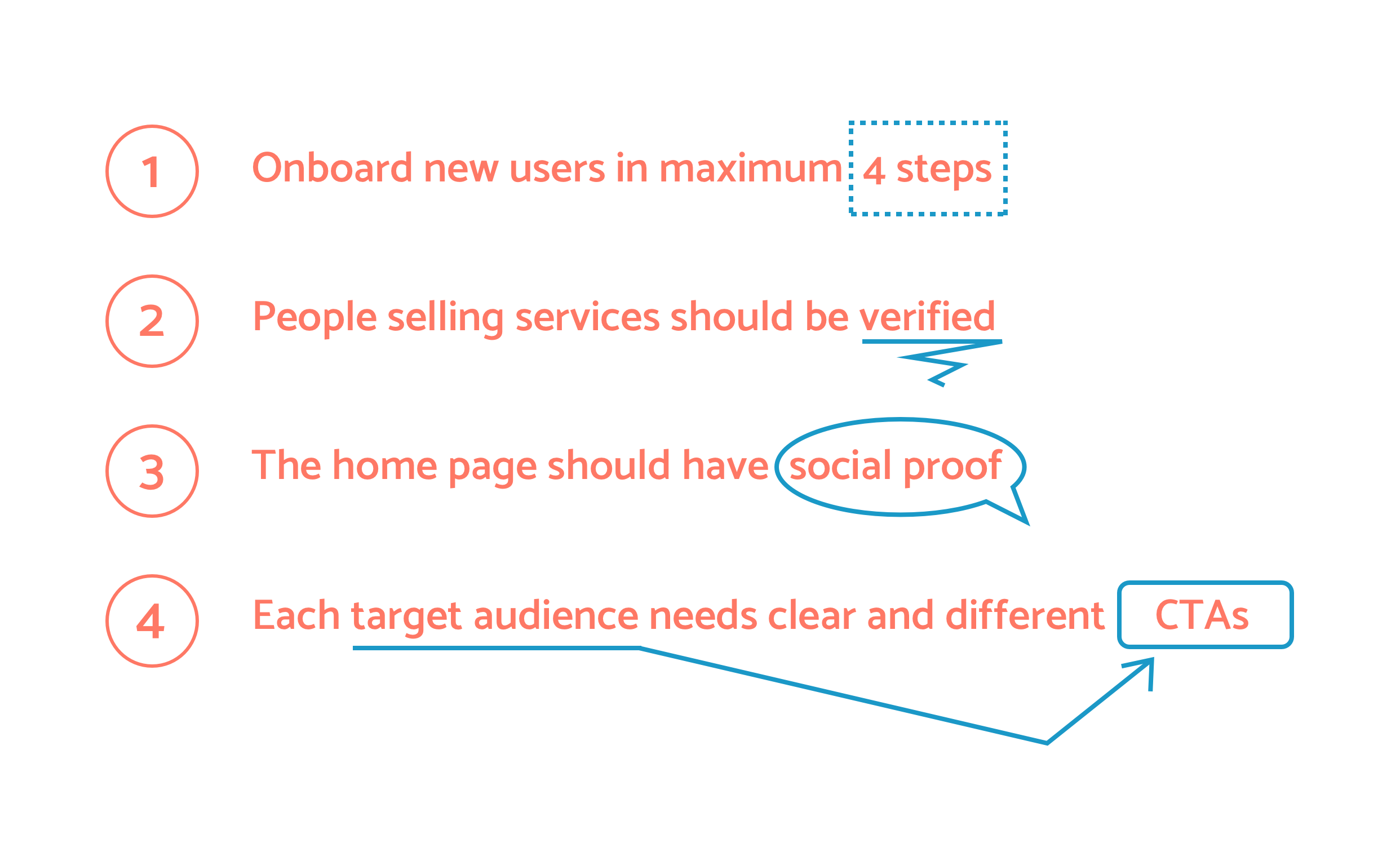
Major insights learned from competitor and comparable marketplace apps
USER FLOWS
I love the uphill challenge of brainstorming a user flow from nothing, and this project was particularly engaging because we needed to juggle three entirely different stakeholders harmoniously in one platform. To add fuel to the fire, it seemed likely that many users would find themselves wanting to be both a Volunteer and a Buyer, sometimes donating services and other times paying for them.


Planning out our flows was hardly a perfect process. It was an effort of iteration, conversation, user testing, and a lot of playing devil’s advocate with the team. Ultimately, I was able to synthesize the drafts into a combined stakeholder flow that handled the many overlapping stakeholder journeys:

Design Sprints
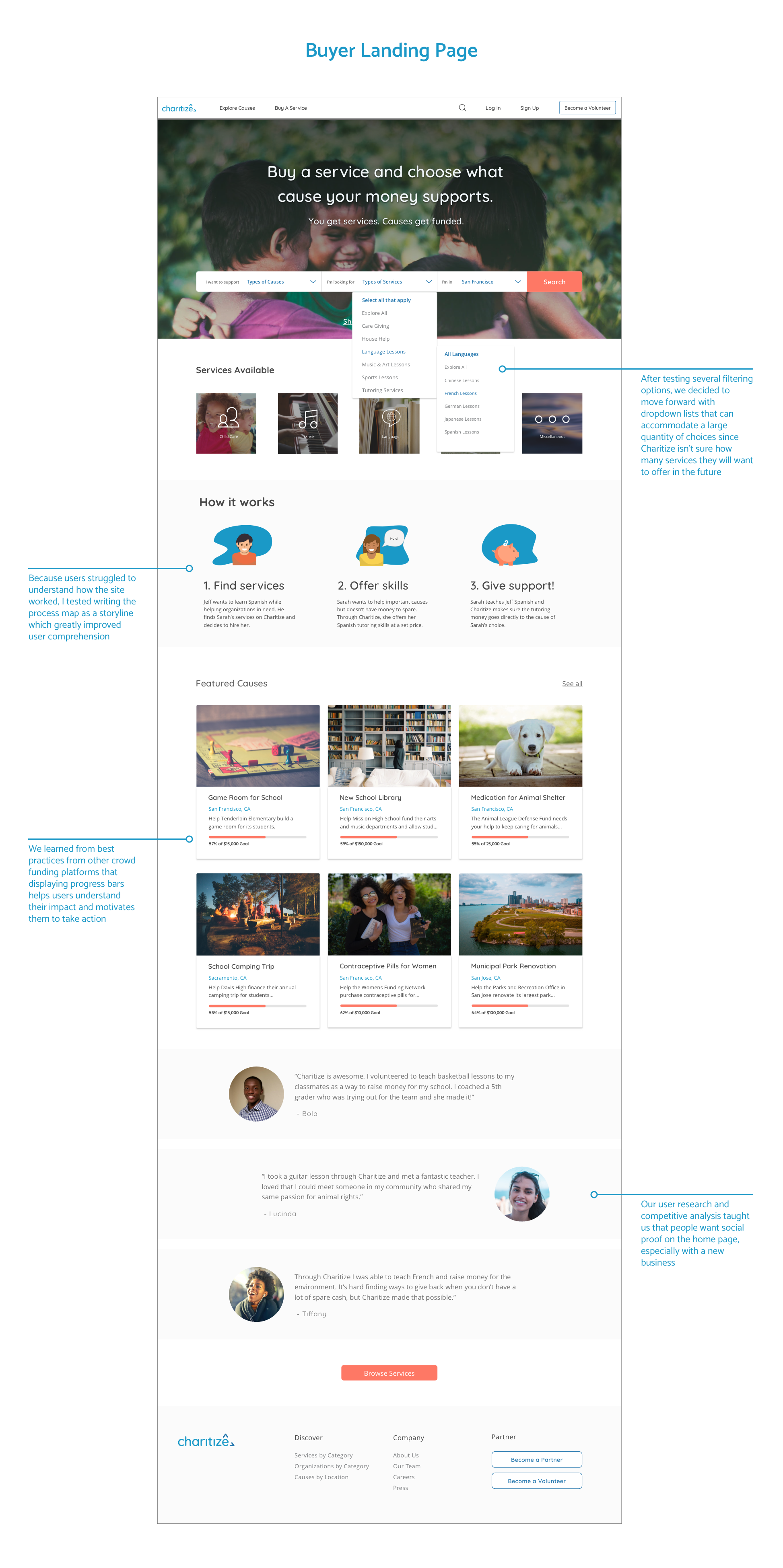
Wanting to push the project forward quickly, I had our team break out into small group design sprints to focus on each stakeholder. I led the team that dealt with the Buyers (the people actually paying for services) through a series of collaborative design exercises with the ultimate goal of defining what an MVP for this flow would encompass. After an engaging series of mind mapping, crazy 8’s, storyboarding, and dot voting, the culmination of our effort was agreement on our favorite features to turn into lo-fi mockups.

Storyboard that I drew that shows the flow from the landing page to booking a volunteer

Some quick sketches of a volunteer profile and the landing page
Lo-fi: Buyer Flow
With the large undertaking of building an entire marketplace, I emphasized the idea that this wasn’t the time to reinvent the wheel. Instead, everyone needed to flex their research muscle and use design elements that they had already seen effectively in practice elsewhere. We started crunching together rough mockups, constantly putting them in front of users for quick comprehension tests. If a new user couldn’t tell what we were doing in five seconds, we went back to the drawing board.

Lo-fi validation tests showed us that we were on the right track with our user flows
Result
With our lo-fi flows updated and tested, the team jumped into creating the final hi-fi pages to hand over to the client. We still managed to squeeze in time for some final rounds of validation testing, and our ultimate handover even included recommendations for further work that could be incorporated into the next iteration of the product.
The Charitize founders were ecstatic with the quality and scope of the work, and I was proud of the output that my team was able to generate in just six short weeks.

